How to analyze a coin using the spread history chart?
with ArbitrageScanner!
Quick guide: how to use the spread history chart
1. How to open the chart
Click the “Open” button in the “Spread History Chart” column.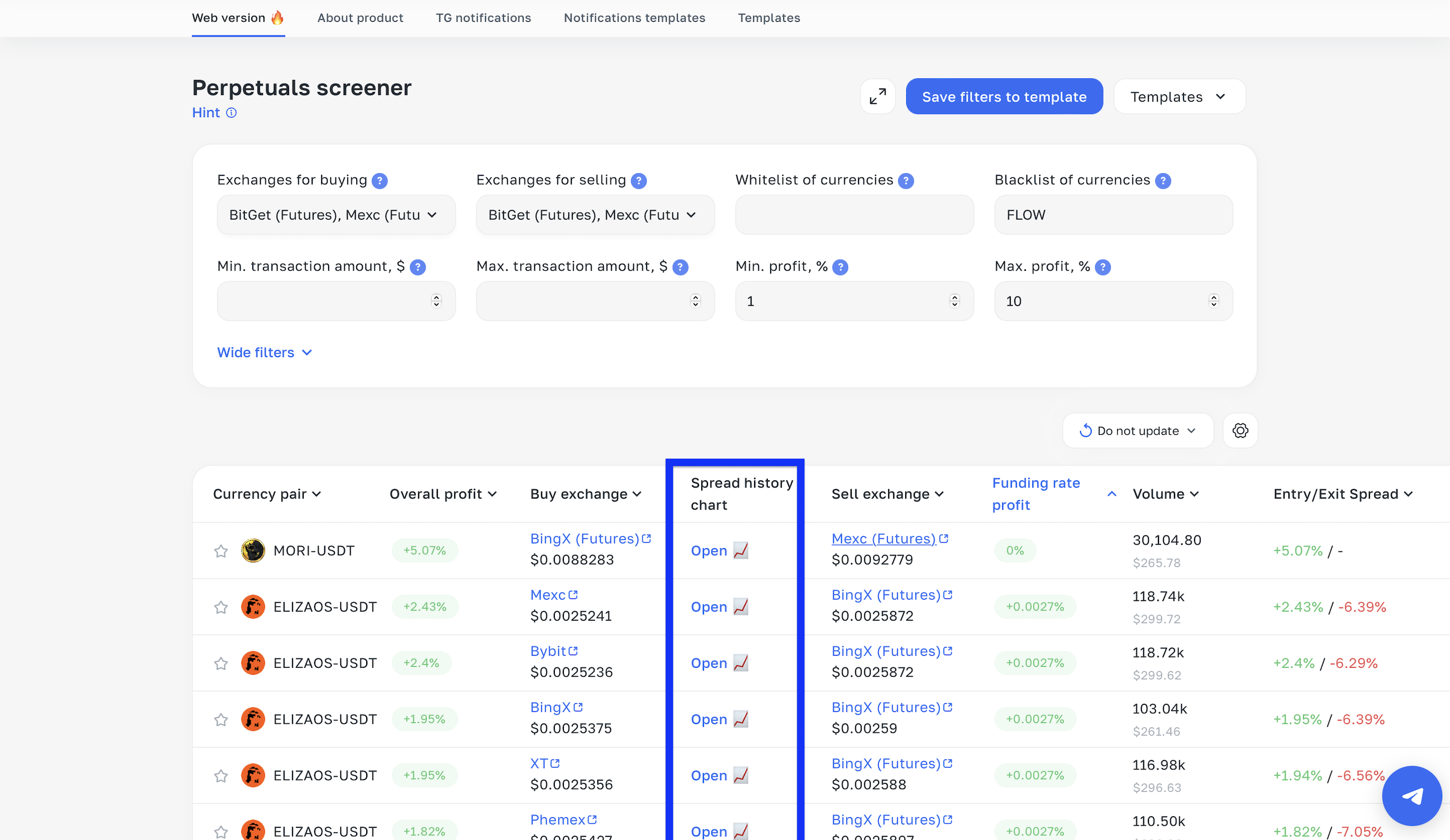
After that, you will be taken to the chart page.
2. What it is and how to read it
This chart shows the historical change of the spread in percent — similar to a regular price chart, but it displays the difference between assets across exchanges IN PERCENT (that same spread).
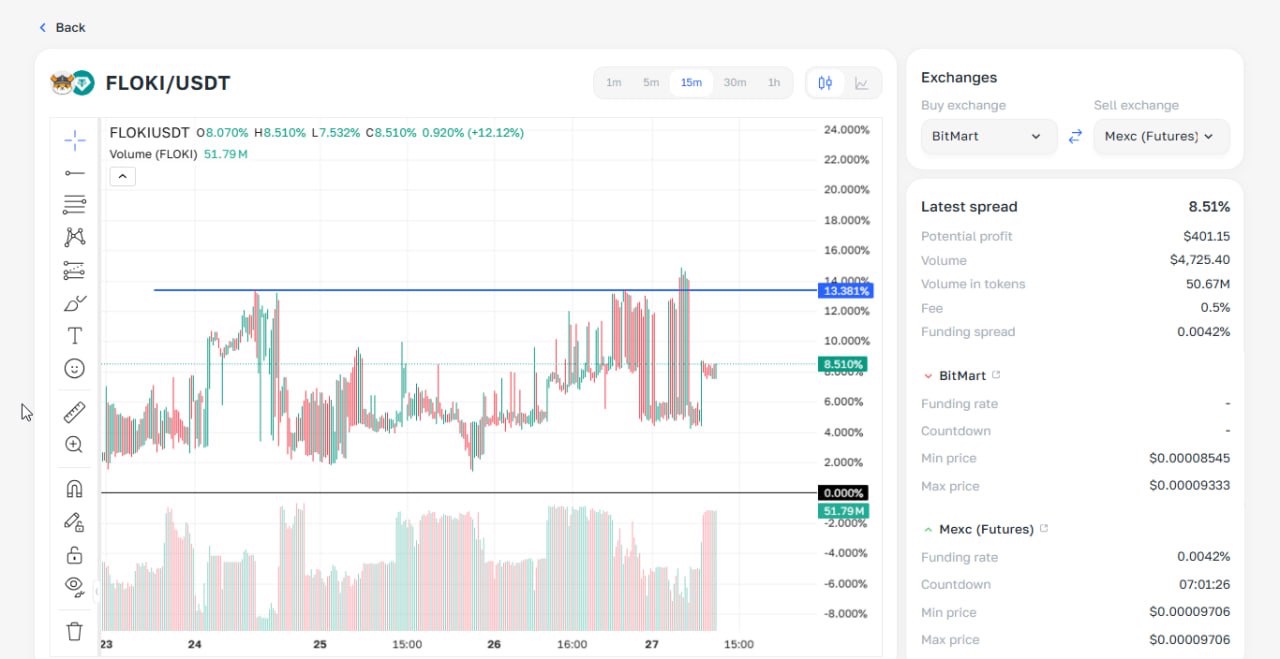
Example: At the point where the blue line crosses the candle, the spread was 13.38% (prices diverged by 13.38%).
3. How to analyze before a trade
Let’s look at the specific chart above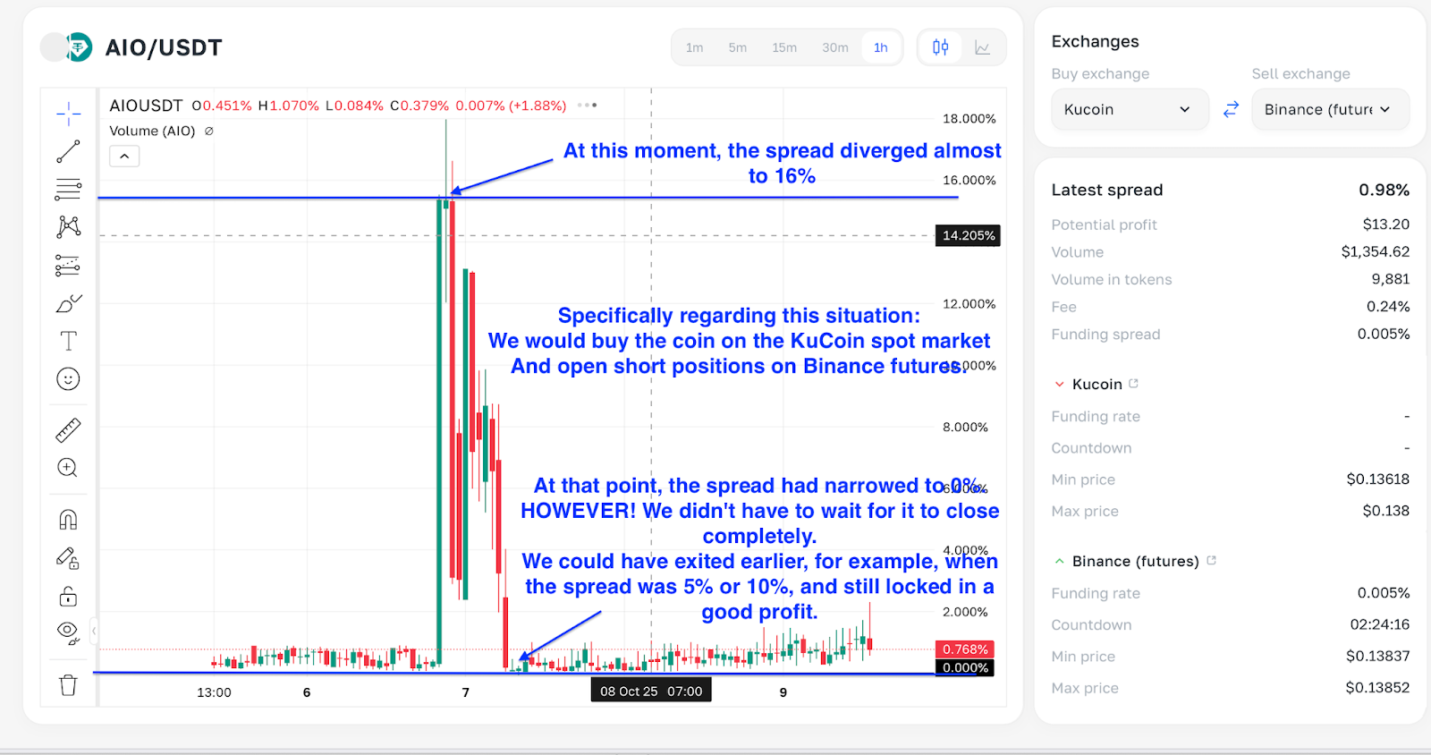
Checking this chart is a mandatory step before any trade.
Why is this needed?
The chart helps determine the maximum and minimum spread for the coin over the selected period, so you can assess the trade’s potential.
If you enter at the minimum spread (the red line in the screenshot):
The spread will most likely start widening, which can lead to a loss.
If you enter at the maximum spread (the blue line in the screenshot):
There is a high probability that the spread will start converging toward its minimum values, which can bring profit.
Want to learn more about crypto arbitrage?
Get a subscription and access the best tool on the market for arbitrage on Spot, Futures, CEX, and DEX exchanges.