Exchange Asset Chart
with ArbitrageScanner!
One of the key tools for trading is the chart.
A chart is a visual representation of the price movement of a selected asset over a specific period of time.
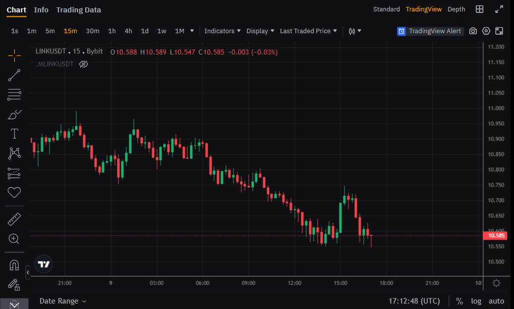
Chart Types
Let’s review the chart types and their features, which you can select here:
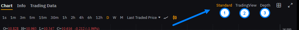
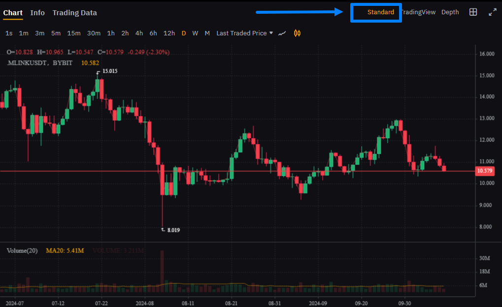
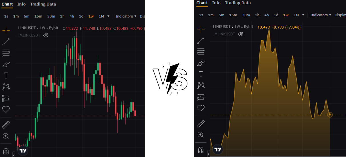
Standard
This is a basic chart with essential tools for price analysis. It is suitable for those who want to quickly see the general price movement. You cannot customize it, but despite that, it is ideal for beginners thanks to its simplicity and ease of use:
TradingView
An advanced chart version that includes a wide range of tools:
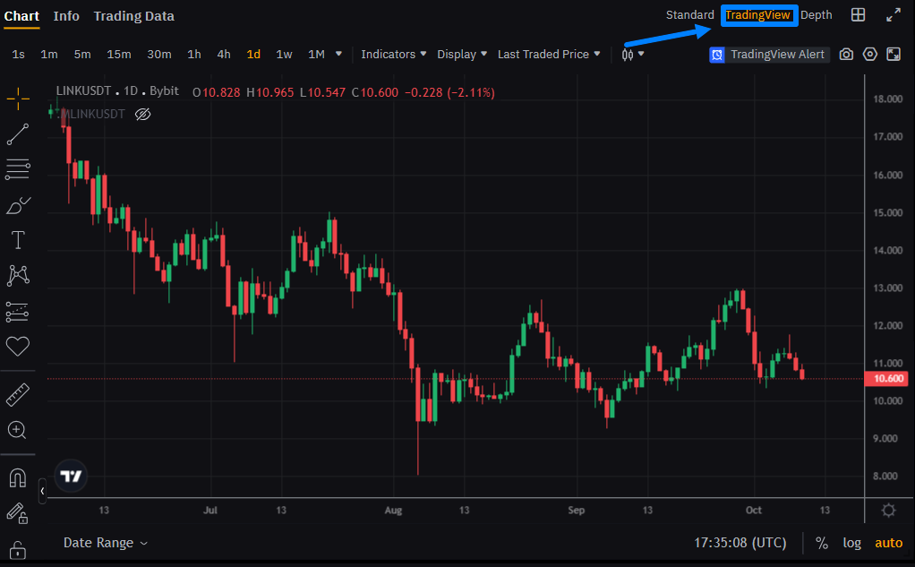
It provides customization options (background changes, bar color adjustments, etc.), indicator settings, drawing trend lines, and other elements. This chart suits both beginners and experienced traders who use technical analysis tools.
Depth Chart
Displays the ratio of buy and sell orders, visualizing supply and demand using two opposing curves:
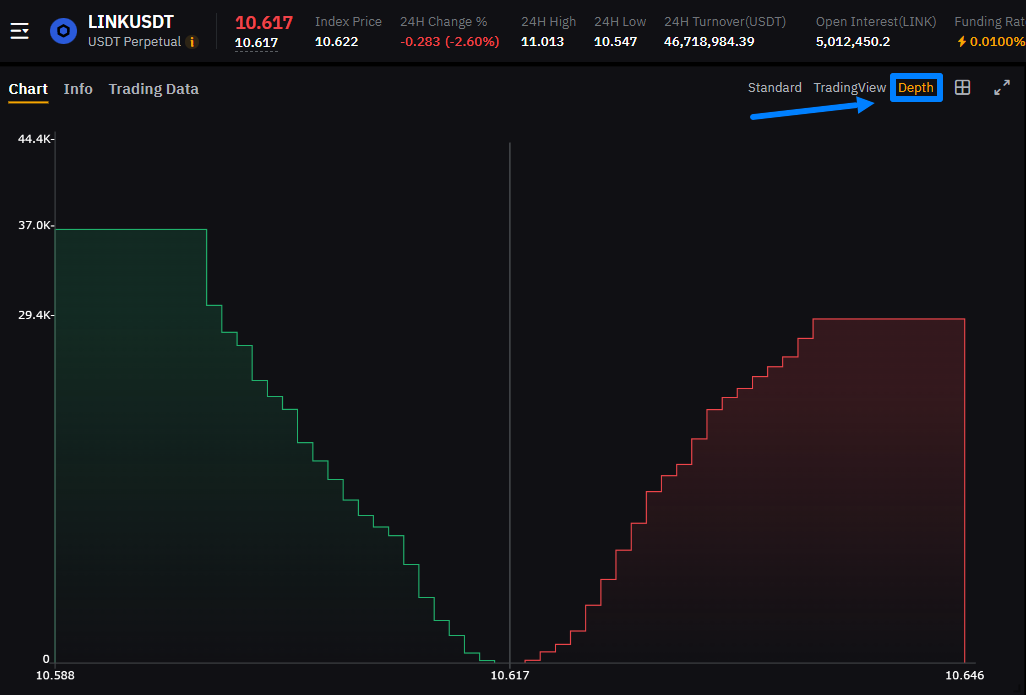
This chart contains two curves:
-
Green curve (left side) — shows buy orders. The higher the buy volume at a certain price, the higher the curve.
-
Red curve (right side) — shows sell orders. The more sellers at a certain level, the higher this curve.
The intersection of these two curves represents the current market price.
This type of chart is used for:
-
Understanding liquidity. The depth chart shows how easy or difficult it is to buy or sell an asset without significantly impacting the price.
-
Assessing supply and demand balance. You can see where buyers or sellers are more concentrated. If the buyer curve is significantly higher, this may indicate strong demand.
Chart Elements
Charts contain important elements that help analyze price movement. Understanding them allows you to read charts faster:
Time Intervals (Timeframes)
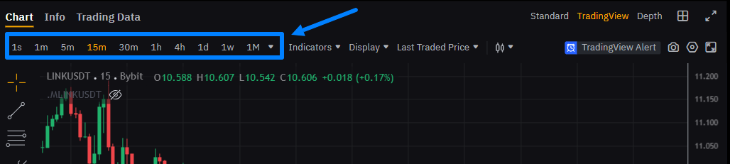
This is the time range displayed on the chart. For example, you can view price changes over 1 minute or one day. Selecting a timeframe helps you understand short-term and long-term price behavior.
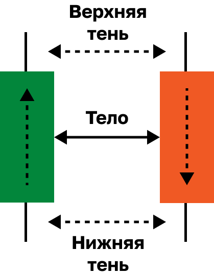
Bars or Japanese Candlesticks
This is the primary way price is displayed. Each candlestick shows:
-
High price;
-
Closing price;
-
Opening price;
-
Low price.
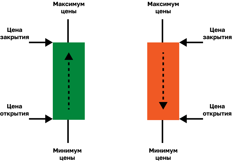
Each candlestick consists of:
-
Wick (shadow) — highest and lowest price levels reached;
-
Body — the range between opening and closing prices.
If the candle body is red, the closing price is lower than the opening price. If it is green, the closing price is higher.
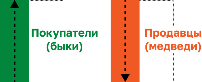
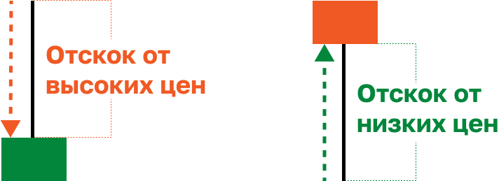
To understand candlesticks, and therefore read charts, you should focus on three factors:
-
Candle color shows who controls the market — buyers (bulls) or sellers (bears).
-
Wick length shows price rejection from a certain level.
-
Body size shows the strength of buyers or sellers.
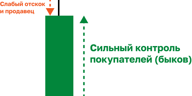
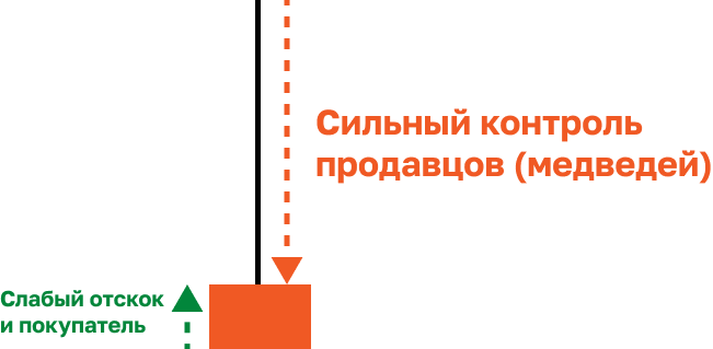
By combining these three factors, you can read charts effectively.
Indicators
These are special tools added to charts to better understand market conditions:
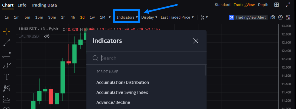
For example, moving averages (MA) show how price changes over time, while the Relative Strength Index (RSI) helps determine whether an asset is overbought or oversold.
Trading Volume
This is the amount of an asset that has been bought and sold over a certain period:
High volume may indicate strong interest in an asset and can significantly impact price.
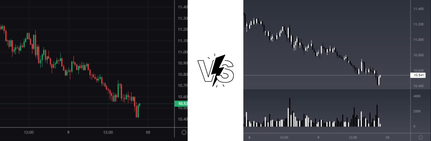
Chart Display Style
Charts allow you to choose between different display styles:
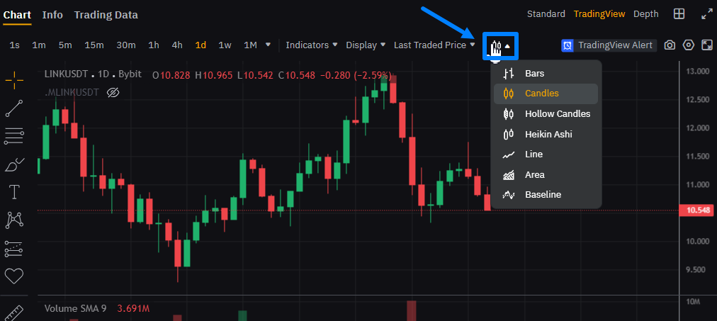
You can select bars, candles, line charts, area charts, and more from the dropdown menu.
Switching to line or area charts allows you to evaluate the overall trend. While this simplifies trend visualization, it is less suitable for detailed lower-timeframe analysis.
Candlestick charts, on the other hand, are considered the most informative. They show open, close, high, and low prices, providing a detailed view of market movements.
RECOMMENDATION: When arbitraging futures, use candlestick charts due to their high information value.
Cursor and Crosshair
These tools help you view exact price and time values on the chart:
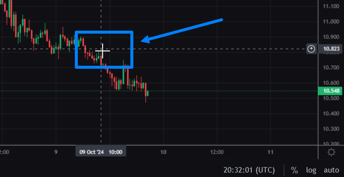
By hovering over a specific bar, you can see the price and date when the asset was traded.
Zoom and Chart Navigation
These tools allow you to zoom in/out and scroll through historical price data.
When working on a computer:
-
Use the mouse wheel or touchpad to zoom in or out.
-
Hold the left mouse button or touchpad to drag the chart.
When working on a smartphone:
-
Pinch or spread two fingers to zoom.
-
Swipe left or right to scroll.
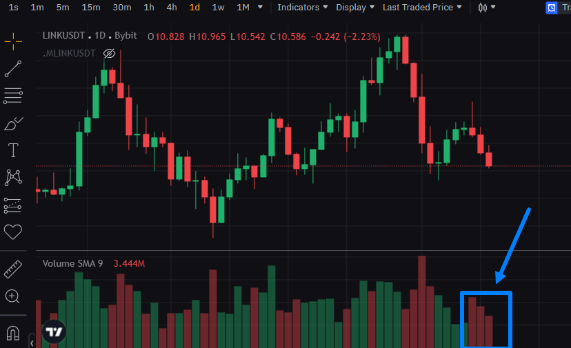
Chart Personalization
You can customize charts by changing background colors, adding indicators, and other tools (trend lines, markers, text, etc.):
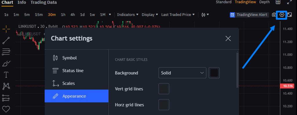
Below is an example of personalization and adding a volume indicator:
These settings can significantly improve comfort and efficiency.
NOTE: Personalization features are generally available in the TradingView chart type.
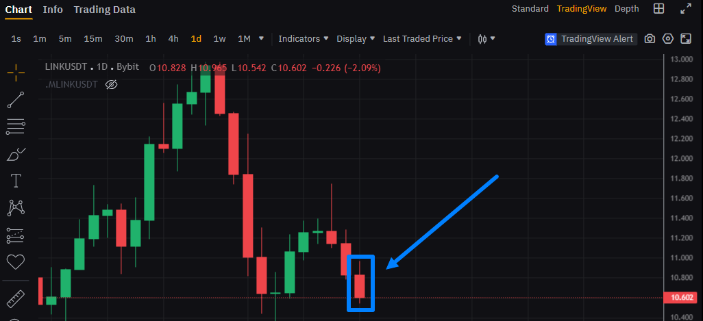
Key Price Metrics for the Timeframe
These values help quickly assess asset behavior over a selected timeframe:
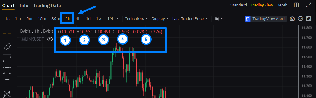
They include:
-
O (Open) – opening price of the timeframe.
-
H (High) – highest price.
-
L (Low) – lowest price.
-
C (Close) – closing price.
-
Absolute and relative price change.
These metrics allow you to quickly evaluate price performance.
Time and Price Axes
Every chart includes two axes:
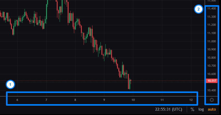
The time axis is located at the bottom and shows timestamps, helping track price changes over time.
The price axis is located on the right and displays price levels. The current price is usually highlighted to make it easier to locate.
Want to learn more about crypto arbitrage?
Get a subscription and access the best tool on the market for arbitrage on Spot, Futures, CEX, and DEX exchanges.