Bitcoin Rainbow Chart Guide


with ArbitrageScanner!
Trading cryptocurrencies today presents various challenges. More than just a 'luck' based trading system, traders will need tools to have any hope in a difficult cryptocurrency market.
The Bitcoin Rainbow Chart is one of the most recognized charts of its kind and uses logarithmic regression to compare historical movement in the price of Bitcoin and gives traders the ability to gain a long-term view of where the price of Bitcoin has been; how much value it has lost; when the price is near the bottom zone relative to historical value; and whether or not the Bitcoin market typically has been overvalued (speculative bubbles).
The Structure and Interpretation of the Rainbow
The Bitcoin rainbow chart is simply a logarithmic growth curve of price against a colour spectrum in relation to history and represents the historical price curve of Bitcoin as opposed to a traditional line chart. This chart reflects the decrease in marginal returns and volatility as Bitcoin gains maturity as an asset.
The rainbow chart has 7 colours with the price ranges associated with each colour representing the price condition associated with each historical price movement.
The Seven Color Bands Breakdown
Each of the seven colours indicates a particular psychological price condition that exists in the Bitcoin market:
- Dark Red = Extremely overvalued (Maximum Bubble Territory) - This has historically been the sell signal.
- Orange/Red = Maximum Bullish Momentum (FOMO Increased) - Caution advised.
- Yellow = HODL! = Fair Value (Friendly towards trend).
- Green = Accumulate = Attractive for Long Term Investing.
- Light Blue / Blue = Fire Sale (Lowest Risk Entry) - BTC will be extremely undervalued.
Reading Price Positions Within the Spectrum
In determining the current price of Bitcoin from the Bitcoin rainbow chart, you want to look at where the current price of BTC sits concerning the 7 colour price curves. When the asset dips into the blue regions of the bands, it represents good buying opportunities for investors, whereas as it rises into the warmer bands, it indicates the increasing probability of a potential correction within a given market.
Buy and Sell Indicators on the Chart
The chart acts as a piece of visualization for buy and sell signals, indicating possible cycle tops/bottoms; the chart does not define exactly when a peak will occur; rather, it shows the probability of a cycle top/bottom in order for traders to be able to focus on the broader trend in the blockchain economy rather than on minor fluctuations.
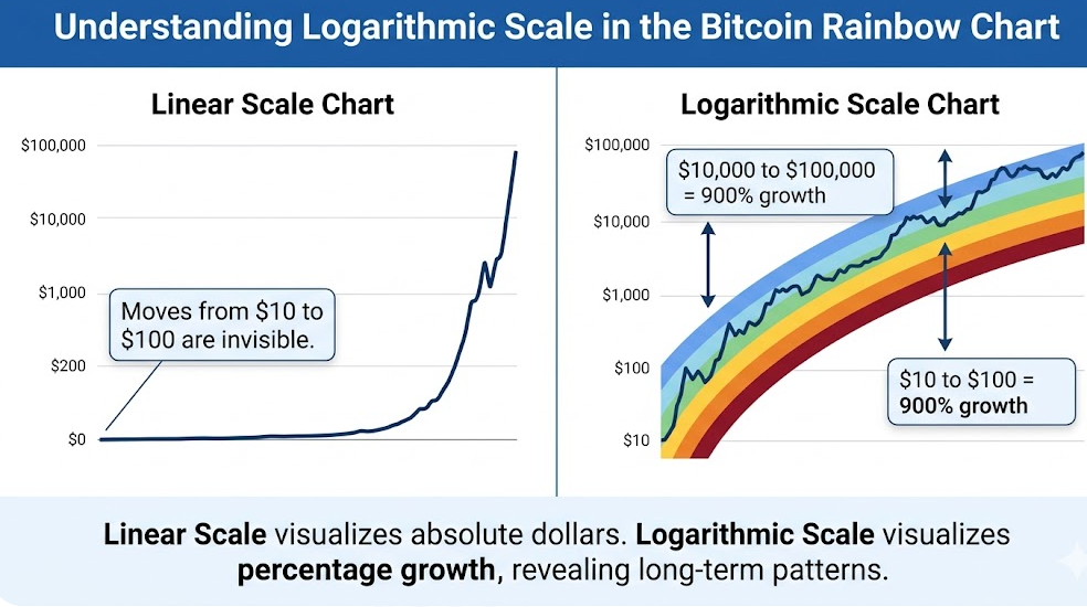
Logarithmic Scale Significance
A logarithmic scale is necessary when working with Bitcoin prices due to the fact that they have increased (and continue to increase) exponentially; price movement in the past would be visually exhibited as a straight line on a linear diagram; however, because the logarithmic diagram shows the actual amount of growth via percentage, it clearly demonstrates that a move from $10 to $100 is equivalent to a move from $10,000 to $100,000.
The Historical Evolution of the Rainbow Chart
The rainbow chart was not created in a single day; it is the result of a collaborative effort over several months of community analysis and continued mathematical refinement in the development and construction of cryptocurrencies and their respective price trendlines.
Origins in the 2014 Bear Market
The first version of the chart was created during the bear market of 2014, during a time of extreme psychological and economic uncertainty, as the Rainbow Chart allowed for the evaluation of price projections for future value of Bitcoin and led to an acceptance that the 2014 price drop was part of the larger trajectory.
The Original Creator and Early Versions
The original creator of the banded rainbow price chart was a user on Reddit named azop, who created the first colorful banded price chart and published it on BlockchainCenter.net, where it was updated and developed into a live tool for millions of investors around the world.
The Transition to Version 2
In 2022, the first version was proven to be invalid when Bitcoin dropped below the "Fire Sale" band due to the collapse of FTX. Since this caused version one to be invalid, version two was created with a different regression formula using historical data and addressing Bitcoin’s changing volatility.
Evaluating the Chart's Accuracy
The rainbow has proven historically to be very accurate during Bitcoin halving cycles; however, the Rainbow Chart should not be misconstrued as a financial solicitation or crystal ball. Historically it has had excellent results, but there are some limitations that should be kept in mind.
Limitations of the Rainbow Methodology
The rainbow is a historical representation of Bitcoin's price and growth. It assumes that Bitcoin's price will continue to increase on a certain growth curve. The rainbow does not consider black swan events, severe recessions, or security concerns, which could cause a drastic change in the value of Bitcoin.
Invalidation Points in Market History
The most well-known point of invalidity was in late 2022. For the first time, the price had been below the rainbow for an extended length of time, which illustrated that while the log curve is a good predictor, it is not carved in stone or a law of blockchain physics.
Practical Applications for Cryptocurrency Traders
In order to effectively use the Bitcoin rainbow chart, it is important to incorporate it into an overall strategy for trading.
Combining with Other Technical Analysis Tools
Long-term planning is a more suitable use of this method when used alongside other technical analysis tools (e.g., RSI/On-Chain data). By combining the rainbow with multiple forms of analysis, it will help you with your decision-making and to reduce risk.
Market Cycle Position Assessment
Assessing the current position of the market every few months will allow the investor to determine what stage of the market cycle we are at so they know if we are near a bullish or accumulation phase.
Beyond Bitcoin: Other Cryptocurrency Rainbow Charts
The BTC rainbow chart has been adapted for multiple other digital assets; most notably, the ETH rainbow chart.
The Ethereum Rainbow Chart
The ETH rainbow chart utilizes a similar logarithmic method but accounts for the different growth rates of ETH and the halving-like events including 'The Merge' and 'burning' (EIP-1559). By reviewing both charts, you will have an opportunity to assess how the altcoins are performing against the market leader.
The Scientific Basis Behind the Rainbow Chart
The mathematical basis of the chart is logarithmic regression - the method for finding the "line of best fit" through an ever-increasing point set.
Future Model Adjustments and Expectations
As Bitcoin continues to grow and change, we assume that its price will begin to experience lower volatility due in large part to institutional investment and ETFs beginning to trade in the BTC market. As a result, we believe that BTC will increasingly be found trading with tighter ranges.
Integrating the Rainbow Chart into Your Trading Strategy
Proper use of risk management is essential to successful trading. You should utilize the rainbow chart to help identify possible danger areas for BTC. Blue bands on the chart mark an excellent buying opportunity, orange areas identify BTC levels where you might consider taking profits.
Final Advice for Investors
The final piece of investment advice is to think of the Rainbow Chart as a visual guide only, and not as financial advice. You personally need to conduct your own research (DYOR) into BTC, and keep in mind that there are no historical guarantees of performance.
Conclusion
The Bitcoin Rainbow Chart is a valuable resource for those who want to understand how volatilities across the various markets affect BTC over time, and as shown in the 2022 version 2 update to the chart, the ability of any given model will always be limited; however, the analysis of BTC using logarithmic growth models will provide you with a reference point only when making your investment decisions in this highly complex financial market of Digital Assets.
FAQs
Did the predictive accuracy of the original version of the Rainbow Chart change since the creation of version 2 of the Rainbow Chart?
The original version of the Rainbow Chart was predictive in 2022 up until BTC traded below the lowest price in 2022. Version 2 updated the original model by incorporating historical price data that was added after the creation of the first version of the Rainbow Chart, making version 2 of the Rainbow Chart more predictive about the volatility of BTC in future market conditions.
What mathematical models are the foundations for creating the current Rainbow Chart?
The primary mathematical model in the creation of the current Rainbow Chart is the application of logarithmic regression studies of BTC price over time; specifically the assumption that "BTC will be unlikely to continue to see price increases at an exponential rate in the future".
Can you apply the same methodology to analyze newer cryptocurrencies that may not yet exist?
There is potential to utilize the same methodology to analyze newer cryptocurrencies; however, newer cryptocurrencies may have limited utility as an asset due to the lack of historical price data, which would allow for the creation of reliable regression lines.
How do you calculate when prices begin to break through lower price levels for BTC and other assets outside of the Rainbow Chart?
If you see an asset breaking below the blue band levels of the Rainbow Chart, the asset has probably experienced either significant undervaluation relative to market values, or the validity of the Rainbow Model must be re-evaluated.
What external factors may affect the ability of the Rainbow Chart and the mathematical principles of logarithmic regression to provide predictive value in the future?
Examples of external issues affecting the ability of the Rainbow Chart and the mathematical principles of logarithmic regressions to provide predictive value are: Global macroeconomic changes (ex: rising interest rates), increased governmental regulation of cryptocurrencies, or major failures in the underlying blockchain technology/creation of additional forks.
Want to learn more about crypto arbitrage?
Get a subscription and access the best tool on the market for arbitrage on Spot, Futures, CEX, and DEX exchanges.

You might be interested

The Inverted Hammer Candlestick Pattern

Understanding Cryptocurrency Trading

How to Send Trades From TradingView to Your Trading Bot